This post was created using version 5.x.x of @refinedev/mui. Although we plan to update it with the latest version as soon as possible, you can still benefit from the post in the meantime.
Checkout the Migration Guide for @refinedev/mui for more information.
Just be aware that the source code example in this post have been updated to version 6.x.x.
Introduction
In this article, we'll show how to use Material UI <DataGrid /> component and Refine's useDataGrid hook to render data from a mock API server in tabular form using a Refine application.
Refine is a React-based framework for rapidly developing data-driven applications through a collection of helper hooks, components, and with out-of-box support packages. Additionally, it provides a clean interface for integrating with popular UI frameworks such as Material UI, Ant Design, Mantine, and Chakra UI.
Material UI is a React UI component library with a rich set of components and tools for bootstrapping elegant user interfaces. We'll use the <DataGrid /> component to render a list of employees from a mock server. We'll also look at some of the properties and custom configurations that can be used with the component.
Steps we’ll cover:
- Introduction
- Prerequisites
- Create a new Refine app
- Creating mock API with Mockaroo and My JSON Server
- Material UI DataGrid component
- Adding styled-components
- Refine's
useDataGridhook - Rendering data with the
<DataGrid />component - Pagination, Filtering, and Sorting using the
useDataGridhook - Conclusion
- Live CodeSandbox Example
Prerequisites
To follow along with this tutorial, we assume you have the following:
- Basic knowledge of React and TypeScript
- Node.js installed on your machine
- A code editor of your choice (VSCode, Sublime Text, etc.)
If you don't familiar with Refine, we recommend you to check out the Refine tutorial to get started.
Create a new Refine app
We'll use the npm create refine-app command to interactively initialize the project.
npm create refine-app@latest datagrid-with-refine
Select the following options when prompted:
✔ Choose a project template · refine-vite
✔ What would you like to name your project?: · datagrid-with-refine
✔ Choose your backend service to connect: · REST API
✔ Do you want to use a UI Framework?: · Material UI
✔ Do you want to add example pages?: · No
✔ Do you need any Authentication logic?: · None
✔ Do you need i18n (Internationalization) support?: · No
✔ Choose a package manager: · npm
Once the setup is complete, navigate to the project folder and start your app with:
npm run dev
After the app has started, you should see the following page:

Creating mock API with Mockaroo and My JSON Server
The fake employee data we're going to render in the <DataGrid /> component will be created with Mockaroo and My JSON Server.
Mockaroo is a random fake data generator for generating up to 1,000 realistic test data in JSON, CSV, and other formats.
My JSON Server is a fake online REST Server for prototyping application APIs without a backend. The REST Server for the JSON data we'll use in this tutorial is hosted here, and the fake JSON data created with Mockaroo is on GitHub.
Material UI DataGrid component
The Material UI DataGrid component is an extendable and feature-rich component used to display tabular data in React applications. Some of its powerful features include automatic pagination, table data filtering and sorting, and many other cool features.
The component is available in two versions, the MIT <DataGrid /> and Commercial <DataGridPro /> (Pro and Premium) versions. The MIT version is free-to-use while the commercial version is paid and extends the features of the MIT version such as the ability to filter and sort multiple columns at the same time.
The <DataGrid /> component requires two mandatory properties namely: rows and columns. The columns prop accepts an array of fields which are used as the table header while the rows prop accepts an array of objects (data) to be rendered within the table rows.
The following example shows a basic usage of the <DataGrid /> component:
<DataGrid
  columns={[{ field: "name" }]}
  rows={[
    { id: 1, name: "React" },
    { id: 2, name: "MUI X" },
  ]}
/>
Although Refine is a headless framework that can be used with any UI framework of choice. This means that we can use the <DataGrid /> component in our Refine application without having to worry about integrating it with the framework.
We'll see how to leverage these components with Refine's useDataGrid hook in our Refine app in the coming sections.

Adding styled-components
We'll use styled-components to style our app, as Refine doesn't control how we choose to style our applications. So let's go ahead and install it with its types definition as follows:
npm install styled-components && npm install --save-dev @types/styled-components
Next, create pages folder under the src. This is where we'll create our page components.
Then, create <Layout /> component in the src/components/layout folder with the following code:
import React from "react";
import { LayoutProps } from "@refinedev/core";
import styled from "styled-components";

import { Header } from "../header";

const Wrapper = styled.div`
  width: 80%;
  margin: 50px auto;
  height: 100%;
`;

const Layout: React.FC<LayoutProps> = ({ children }) => {
  return (
    <>
      <Header />
      <Wrapper>{children}</Wrapper>
    </>
  );
};

export default Layout;
In the above code, we're creating a styled div to wrap our app content through the children prop and then aligning it in the center of the page.
Refine's useDataGrid hook
In addition to integrating Material UI components, Refine provides a clean interface through the useDataGrid hook for implementing some properties that can be used with MUI X <DataGrid /> component. The hook simplifies working with features such as pagination, sorting, and filtering which come as out-of-box.
For instance, if you have a page component where you want to render tabular data, you might do something like the below:
import React from "react";
import { useDataGrid } from "@refinedev/mui";
import { DataGrid, GridColDef } from "@mui/x-data-grid";

const Table: React.FC = () => {
  const { dataGridProps } = useDataGrid();
  const columns: GridColDef[] = [
    {
      field: "id",
      headerName: "ID",
    },
    {
      field: "name",
      headerName: "Name",
    },
    {
      field: "Age",
      headerName: "Age",
    },
  ];

  return <DataGrid {...dataGridProps} columns={columns} autoHeight />;
};

export default Table;
It's important to note that in the above example, we're not passing the rows prop to the <DataGrid /> component. This is because the dataGridProps variable automatically injects the rows values into the <DataGrid /> component through the native <Refine /> component's dataProvider prop available in the src/App.tsx file of your Refine application.
The dataProvider prop is used to read data from an API endpoint and then make the data available in the entire application.
Refer to Refine data provider documentation for detailed usage
Rendering data with the <DataGrid /> component
We'll use the mock API we created with Mockaroo and My JSON Server as the data source for our <DataGrid /> component.
To get started, create a file named employees.tsx in the src/pages folder and add the following code:
import React from "react";
import { useDataGrid, List } from "@refinedev/mui";
import { DataGrid, GridColDef } from "@mui/x-data-grid";

const EmployeeList: React.FC = () => {
  const { dataGridProps } = useDataGrid();

  const columns = React.useMemo<GridColDef[]>(
    () => [
      { field: "id", headerName: "ID", minWidth: 30 },
      {
        field: "full_name",
        headerName: "Full Name",
        minWidth: 150,
        flex: 1,
        valueGetter: (_, row) => `${first_name || ""} ${last_name || ""}`,
      },
      {
        field: "email",
        headerName: "Email",
        minWidth: 250,
      },
      {
        field: "department",
        headerName: "Department",
        minWidth: 150,
      },
      {
        field: "role",
        headerName: "Role",
        minWidth: 150,
      },
      {
        field: "level",
        headerName: "Level",
        minWidth: 110,
      },
    ],
    [],
  );

  return (
    <List>
      <DataGrid
        {...dataGridProps}
        checkboxSelection
        columns={columns}
        autoHeight
      />
    </List>
  );
};

export default EmployeeList;
Let's understand what's going on the above code:
The columns variable defines the column fields for our data. We also wrapped the fields in a React.Memo higher order component for memoizing the values and then created fields for each of the properties from our resource endpoint. We also used the valueGetter attribute to compose a value from two different fields.
Next, replace the src/App.tsx file with the following code:
src/App.tsx
import { Refine } from "@refinedev/core";
import { RefineKbar, RefineKbarProvider } from "@refinedev/kbar";
import {
  useNotificationProvider,
  RefineSnackbarProvider,
} from "@refinedev/mui";
import routerBindings, {
  DocumentTitleHandler,
  NavigateToResource,
  UnsavedChangesNotifier,
} from "@refinedev/react-router-v6";
import dataProvider from "@refinedev/simple-rest";
import CssBaseline from "@mui/material/CssBaseline";
import GlobalStyles from "@mui/material/GlobalStyles";
import { BrowserRouter, Route, Routes, Outlet } from "react-router-dom";

import { ColorModeContextProvider } from "./contexts/color-mode";
import Layout from "./components/layout";
import EmployeeList from "./pages/employees";

function App() {
  return (
    <BrowserRouter>
      <RefineKbarProvider>
        <ColorModeContextProvider>
          <CssBaseline />
          <GlobalStyles styles={{ html: { WebkitFontSmoothing: "auto" } }} />
          <RefineSnackbarProvider>
            <Refine
              dataProvider={dataProvider(
                "https://my-json-server.typicode.com/Mich45/employee-data",
              )}
              notificationProvider={useNotificationProvider}
              routerProvider={routerBindings}
              resources={[
                {
                  name: "employees",
                  list: "/employees",
                },
              ]}
              options={{
                syncWithLocation: true,
                warnWhenUnsavedChanges: true,
              }}
            >
              <Routes>
                <Route
                  element={
                    <Layout>
                      <Outlet />
                    </Layout>
                  }
                >
                  <Route
                    index
                    element={<NavigateToResource resource="employees" />}
                  />

                  <Route path="/employees" element={<EmployeeList />} />
                </Route>
              </Routes>
              <RefineKbar />
              <UnsavedChangesNotifier />
              <DocumentTitleHandler />
            </Refine>
          </RefineSnackbarProvider>
        </ColorModeContextProvider>
      </RefineKbarProvider>
    </BrowserRouter>
  );
}

export default App;
Here's a breakdown of what is going on in the code:
The <Refine /> component accepts a dataProvider prop which specifies the source of our data (the fake REST API we created earlier), and a resources prop which takes an array of object properties:
- The
nameproperty is the name of the resource we are expecting from the REST API - this value must match the resource we created in the REST API. In our case,employees. - The
listproperty takes a string value which is the path to render the<EmployeeList />component. In our case,/employees.
You can refer to the <Refine /> component documentation for more information on the available props.
With <Route /> components, we defined the routes to render the <EmployeeList /> component when the /employees path is visited. Additionally, we used the <NavigateToResource /> component to redirect to the /employees path when the / path is visited.
Finally, we used the <Layout /> component we created in the previous section to wrap the defined routes.
Now, if you navigate to http://localhost:5173, you should see the following:
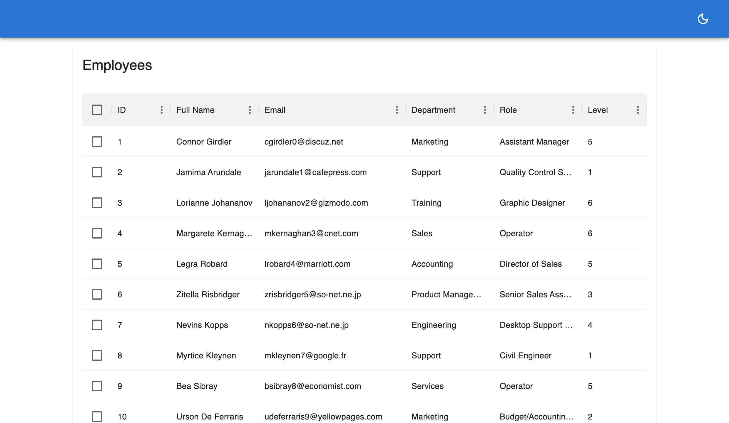
Voila! We've successfully displayed our data from a REST API in a MUI X DataGrid component. In the next section we'll look at how we can use the useDataGrid hook to simplify operations such as pagination, sorting, and filtering.
Pagination, Filtering, and Sorting using the useDataGrid hook
The useDataGrid hook simplifies operations such as pagination, sorting, and filtering on the <DataGrid /> component through a flexible API. In this part, we'll leverage the hook to add pagination, sorting, and filter features to our employees table data.
Pagination
Pagination lets us display a certain number of rows on a DataGrid at a time and is enabled by default. It cannot be disabled either. It is available at the bottom of the DataGrid component like so:
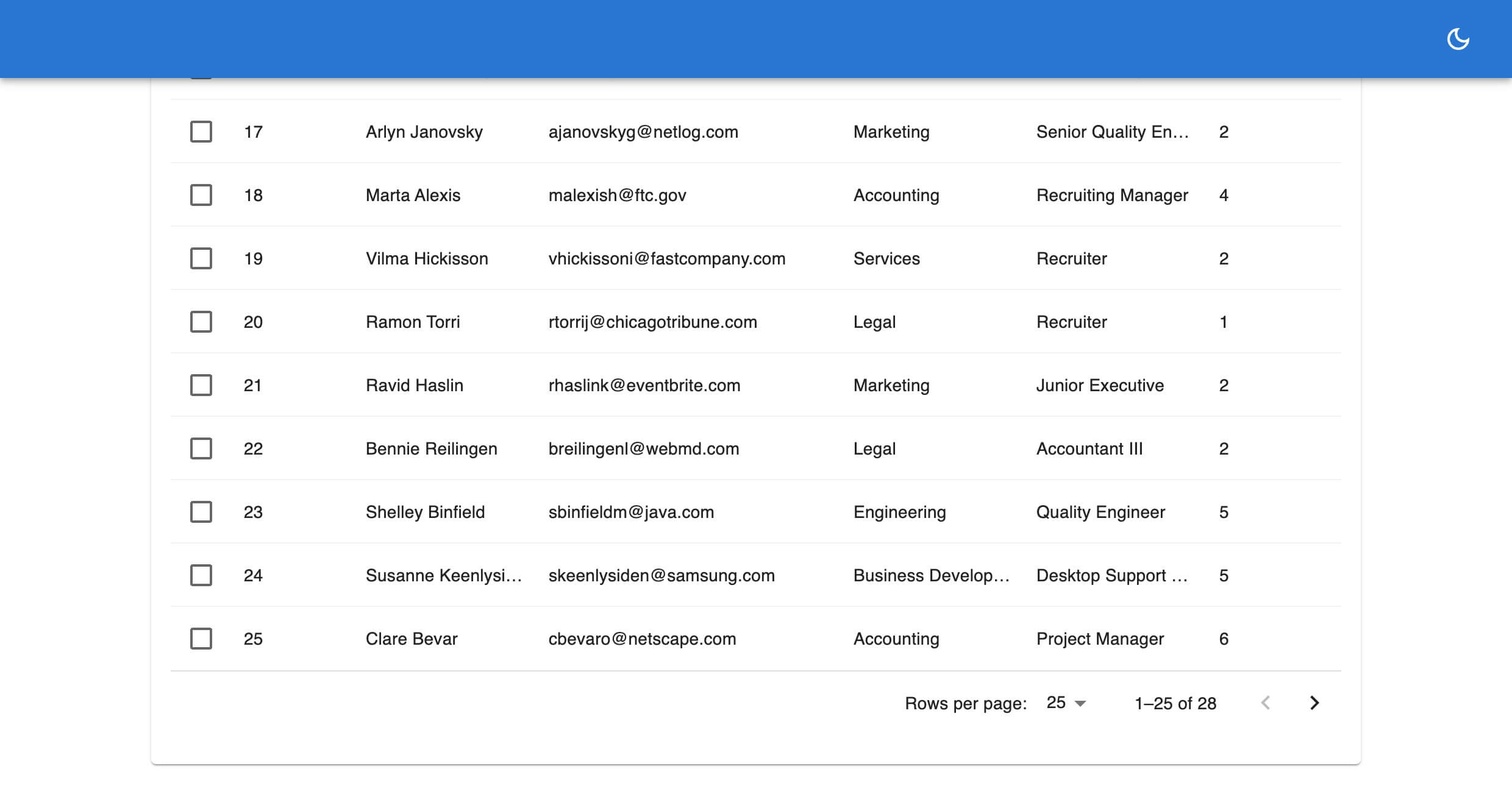
For example, our employees list has a total of 28 rows, but we may want to render just 5 rows per page. Here’s a demo showing how we can render 5 rows of items on the initial page render with the pagination.pageSize property (defaults to 25).
This is similar to using the initialState prop on the DataGrid component. We can also define how many rows the user can choose to view per page using the rowsPerPageOptions prop.
Update the employees.tsx with the following codes:
//...
import { useDataGrid, List } from "@refinedev/mui";
import { DataGrid, GridColDef } from "@mui/x-data-grid";

const EmployeeList: React.FC = () => {
  const { dataGridProps } = useDataGrid({
    pagination: { pageSize: 5 },
  });

  //...

  return (
    <List>
      <DataGrid
        {...dataGridProps}
        checkboxSelection
        columns={columns}
        autoHeight
        pageSizeOptions={[5, 10, 20]}
      />
    </List>
  );
};

export default EmployeeList;
Which renders our grid like this:
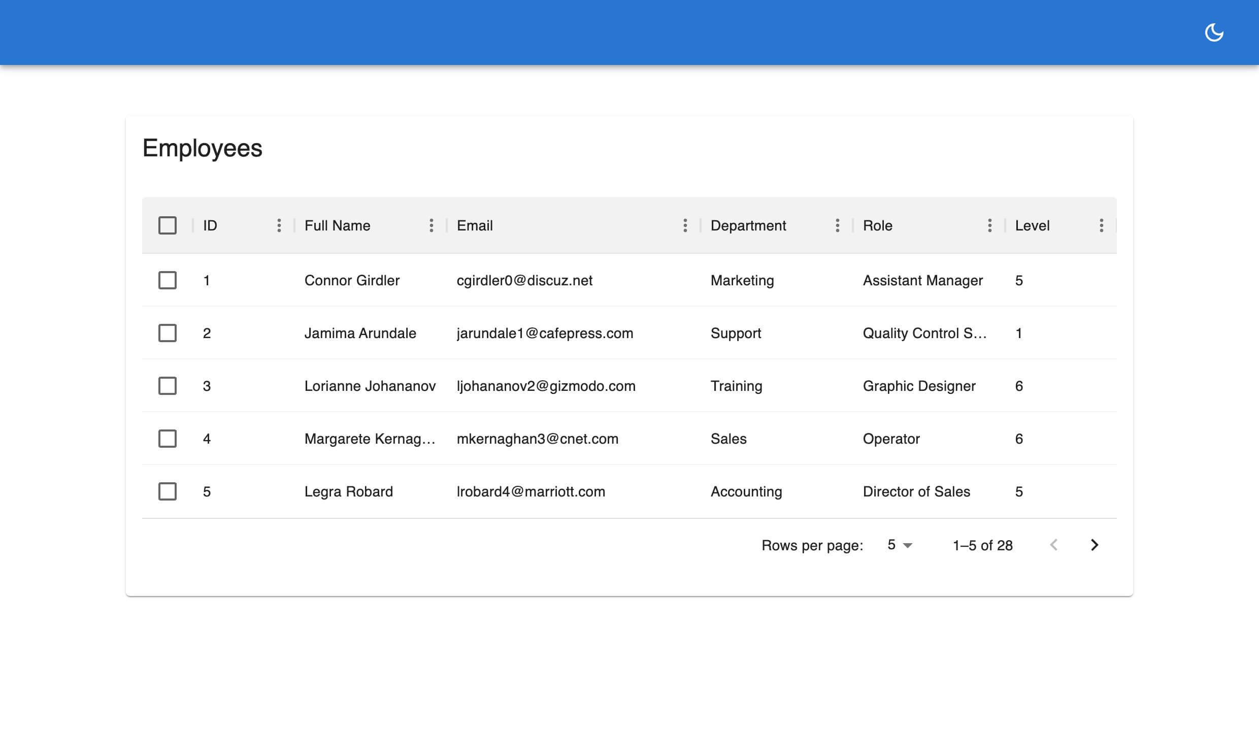
By default, syncWithLocation is set to true in the <Refine /> component. This means that the pagination property will be overridden by the pageSize query parameter in the URL. If you don't see your pagination settings reflected in the grid, remove the pageSize query parameter from the URL and reload the page.
You can refer to the MU X DataGrid documentation for more information on the pagination feature.
Sorting
The DataGrid component lets us sort the data in the rows based on one criterion at a time. Sorting is enabled for all columns by default in the MIT version and can also be disabled either for all columns or a single column.
We can sort the rows in three orders: ascending (ASC), descending (DESC) or null (sorting will be disabled).
To sort the rows, click or hover on any column header, this displays an arrow indicator pointing up or down depending on your sorting order. When it's ascending the arrow points upward, and points downward for descending. Alternatively, we can also access it from the grid column menu.
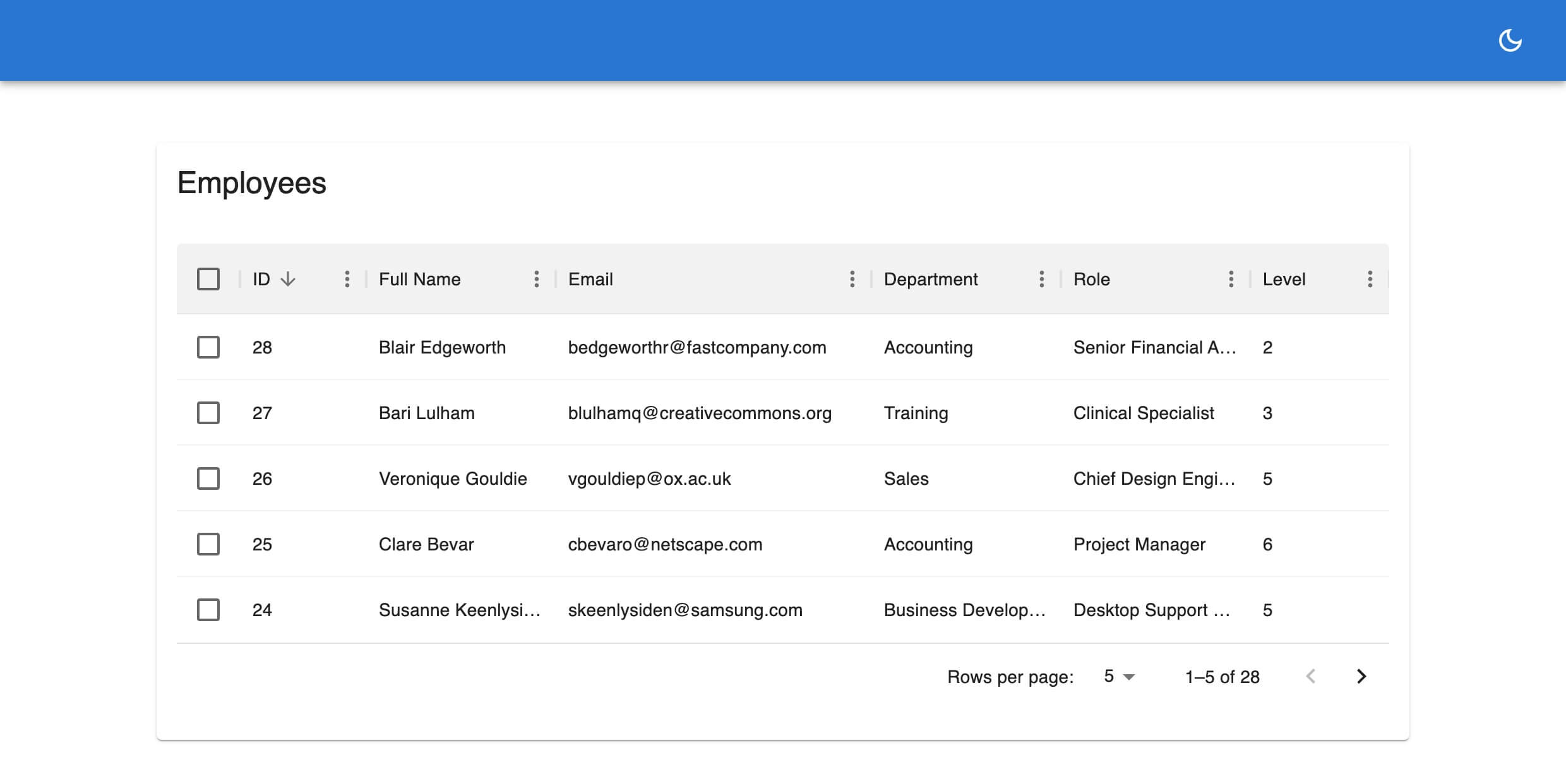
Initial sort order
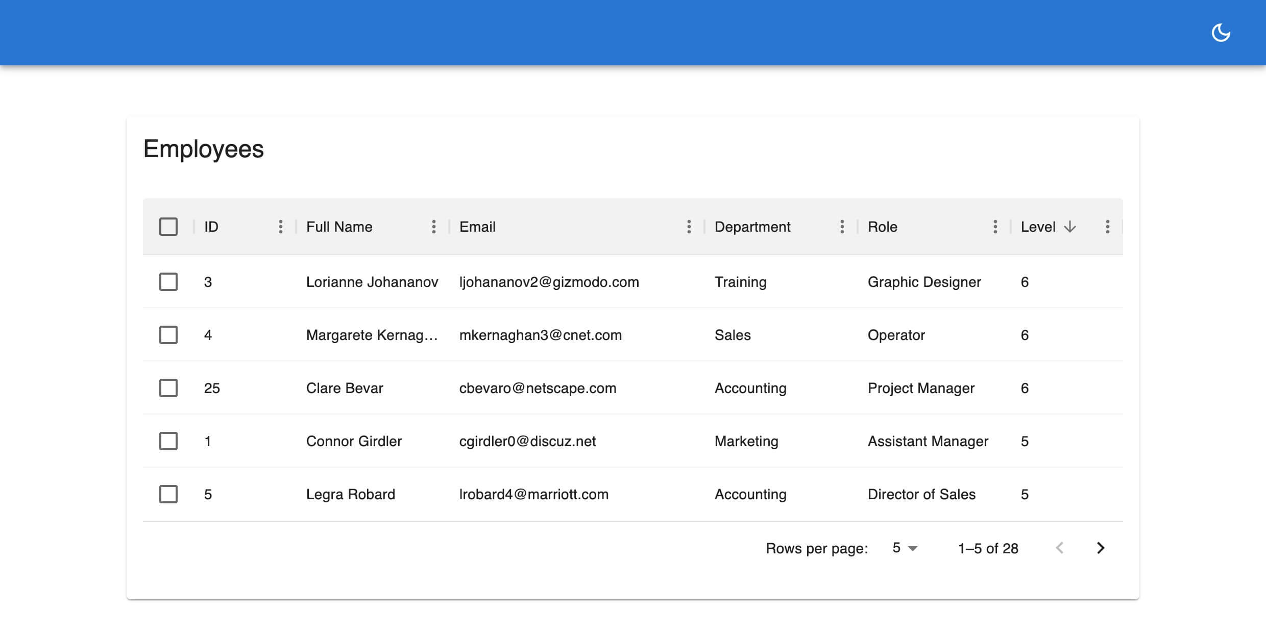
We can initialize a sorting order for each or all fields in the grid using the sorters property of the useDataGrid component. This lets us sort the rows on the initial page render.
const { dataGridProps } = useDataGrid({
  sorters: {
    initial: [{ field: "level", order: "desc" }],
  },
});
The above example will sort the rows using the level column on the initial render in descending order like so:
Controlled sorting
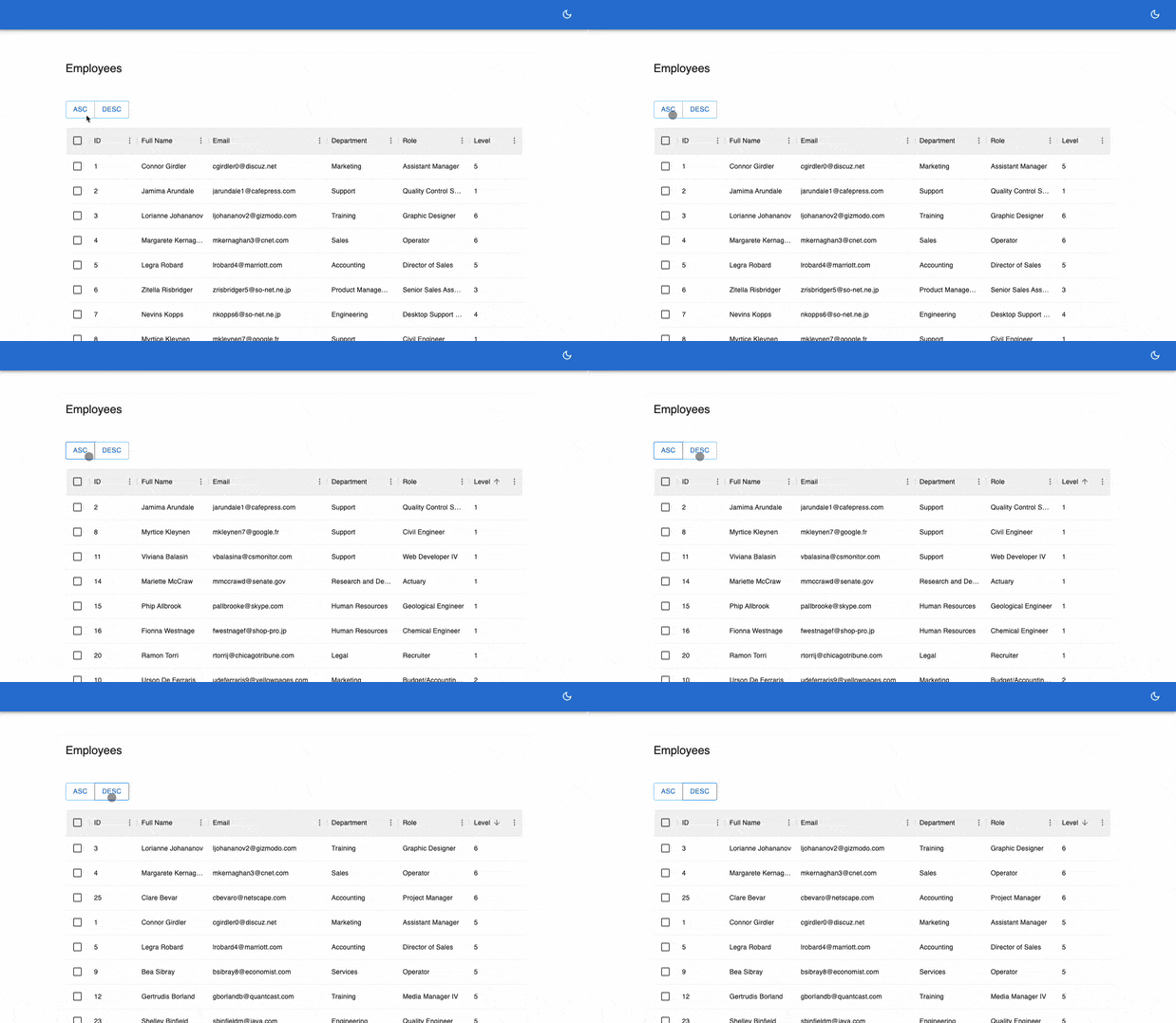
We can also sort rows externally using the setSorter function from the useDataGrid hook. The following code shows how we can sort the rows by clicking on custom buttons outside the DataGrid component.
import React from "react";
import { useDataGrid, List } from "@refinedev/mui";
import { DataGrid, GridColDef } from "@mui/x-data-grid";
import styled from "styled-components";
import Button from "@mui/material/Button";
import ButtonGroup from "@mui/material/ButtonGroup";

const ButtonsWrapper = styled.div`
  width: 100%;
  margin: 20px 0;
`;

const EmployeeList: React.FC = () => {
  const { dataGridProps, setSorters } = useDataGrid();

  const columns = React.useMemo<GridColDef[]>(
    () => [
      { field: "id", headerName: "ID", minWidth: 30 },
      {
        field: "full_name",
        headerName: "Full Name",
        minWidth: 150,
        flex: 1,
        valueGetter: (_, row) =>
          `${row.first_name || ""} ${row.last_name || ""}`,
      },
      {
        field: "email",
        headerName: "Email",
        minWidth: 250,
      },
      {
        field: "department",
        headerName: "Department",
        minWidth: 150,
      },
      {
        field: "role",
        headerName: "Role",
        minWidth: 150,
      },
      {
        field: "level",
        headerName: "Level",
        minWidth: 110,
      },
    ],
    [],
  );

  const handleSorting = (order: "asc" | "desc") => {
    setSorters([
      {
        field: "level",
        order,
      },
    ]);
  };

  return (
    <List>
      <ButtonsWrapper>
        <ButtonGroup variant="outlined">
          <Button onClick={() => handleSorting("asc")}>Asc</Button>
          <Button onClick={() => handleSorting("desc")}>Desc</Button>
        </ButtonGroup>
      </ButtonsWrapper>
      <DataGrid
        {...dataGridProps}
        checkboxSelection
        columns={columns}
        autoHeight
      />
    </List>
  );
};

export default EmployeeList;
Here's a GIF showing the result of the above example.
You can refer to MU X DataGrid documentation for more information on the sorting feature.
Filtering
Filtering lets us search the rows for values in the <DataGrid /> component based on one criterion at a time.
We can access the sort feature by either clicking on the filter item in the column menu:

or by using the filter button in the grid toolbar:

You can import the <GridToolbar /> component and use it like so:
import { DataGrid, GridToolbar } from "@mui/x-data-grid";

<DataGrid
  {...dataGridProps}
  checkboxSelection
  columns={columns}
  slots={{ toolbar: GridToolbar }}
  autoHeight
/>;
The filter feature works by searching the rows for values that match a given filter operator. The list of operators which can be used in the sortModel can be found here.
For instance in our employees table we can filter the department column for rows that contain a Support value by using any of the above methods.

Here's the code for the above example. Update the employees.tsx with highlighted code.
import React from "react";
import { useDataGrid, List } from "@refinedev/mui";
import { DataGrid, GridColDef, GridToolbar } from "@mui/x-data-grid";

const EmployeeList: React.FC = () => {
  const { dataGridProps } = useDataGrid();

  //...

  return (
    <List>
      <DataGrid
        {...dataGridProps}
        columns={columns}
        slots={{ toolbar: GridToolbar }}
        autoHeight
      />
    </List>
  );
};

export default EmployeeList;
dataGridProps provides the filterMode, filterModel and onFilterModelChange properties which can be used to control the filter state of the <DataGrid /> component.
Controlled filtering
We can also choose to filter the table externally by using the setFilters function of the useDataGrid hook to set a filter state. The function accepts three properties to filter the table.
field- the column field in the table to apply the filteroperator- the criterion to filter the tablevalue- the value to search for
Here's an example showing how we can use a custom checkbox to search the rows for employees with role that equals Recruiter.
Update the employees.tsx with highlighted code:
import React from "react";
import { useDataGrid, List } from "@refinedev/mui";
import { DataGrid, GridColDef, GridToolbar } from "@mui/x-data-grid";
import FormControlLabel from "@mui/material/FormControlLabel";
import Checkbox from "@mui/material/Checkbox";

const EmployeeList: React.FC = () => {
  const { dataGridProps, setFilters } = useDataGrid();

  const columns = React.useMemo<GridColDef[]>(
    () => [
      { field: "id", headerName: "ID", minWidth: 30 },
      {
        field: "full_name",
        headerName: "Full Name",
        minWidth: 150,
        flex: 1,
        valueGetter: (_, row) =>
          `${row.first_name || ""} ${row.last_name || ""}`,
      },
      {
        field: "email",
        headerName: "Email",
        minWidth: 250,
      },
      {
        field: "department",
        headerName: "Department",
        minWidth: 150,
      },
      {
        field: "role",
        headerName: "Role",
        minWidth: 150,
      },
      {
        field: "level",
        headerName: "Level",
        minWidth: 110,
      },
    ],
    [],
  );

  const handleFilter = (
    e: React.ChangeEvent<HTMLInputElement>,
    checked: boolean,
  ) => {
    setFilters([
      {
        field: "role",
        value: checked ? "Recruiter" : undefined,
        operator: "eq",
      },
    ]);
  };

  return (
    <List>
      <FormControlLabel
        label="Filter Employees with Recruiter Role"
        control={<Checkbox onChange={handleFilter} />}
      />
      <DataGrid
        {...dataGridProps}
        columns={columns}
        slots={{ toolbar: GridToolbar }}
        autoHeight
      />
    </List>
  );
};
export default EmployeeList;
Which gives the following result when you click on the checkbox:

You can refer to MU X DataGrid filtering documentation for more information on the filtering feature.
Conclusion
In this article we introduced you to the MUI X <DataGrid /> component and how to use it to render tabular data. We also learned how to simplify operations such as pagination, sorting and filtering on the component using the useDataGrid hook.
We hope this article helps you in getting started with the <DataGrid /> component in your Refine applications.
Where to go next? Check the useDataGrid hook documentation and the MUI X <DataGrid /> documentation for additional usage information and reference.
Live CodeSandbox Example
npm create refine-app@latest -- --example blog-material-ui-datagrid


